Senin, 09 Desember 2013

Curiosity - Premium Mobile Template (Mobile)

Curiosity


Notice : (Close the top themeforest header if the demo wont show in the right size)


Curiosity is a great mobile template. Curiosity is a mobile optimized website with 14 different page.


Features :
  • 14 Different page
  • Image slider
  • Mobile gallery with fullscreen function
  • Countdown
  • Filterable portfolio with information
  • Working contact form
  • 2 Service page style
  • 2 Blog page style
  • Google fonts
  • Svg icons
  • Modern navigation
  • Documentation

Sitebar | Mobile & Tablet Responsive Template (Mobile)


Typography Features


  • 1, 2, 3 text columns

  • 1, 2, 3 image columns

  • 1, 2, 3 icon columns

  • CSS3 8 text highlight variations

  • CSS3 Code structures

  • CSS3 Table

  • CSS3 Speach bubbles

  • CSS3 Fields

  • CSS3 8 Color variation small buttons

  • CSS3 8 Color variation big buttons

  • CSS3 8 Buttons with 400 retina ready icons

  • CSS3 Hoirzontal square and rounded charts

  • 4 different testimonial variations

  • 48 icon lists


jQuery Features


  • Custom jQuery Code!

  • CSS3, AJAX, PHP contact form with validation

  • jQuery Page Preloader

  • jQuery Device detection

  • jQuery Tap sliding door

  • jQuery Submenus

  • jQuery 4 Toggle Variations

  • jQuery Tabs

  • jQuery Big Notifications

  • jQuery Small Notifications

  • jQuery Checkboxes

  • jQuery Radioboxes

  • jQuery Image Slider

  • jQuery Qute Slider

  • jQuery Text Slider

  • jQuery Thumbnail Slider

  • jQuery Colorbox Portofolio

  • jQuery Swipebox Touch Swipe Gallery


Design Features


  • Ergonomic navigation

  • High Definition Graphics for high definition displays

  • Looks gorgeous on iOS, Nokia, Samsung, HTC, and any device with a high DPI screen and low DPI screen!

  • 48 High definition list icons

  • 400 Icons included for general usage and for the PSD

  • 2 PSD Files included to create new nav items

  • PNG graphics hihgly optimized for extremly fast load times

  • iOS Homepage Icon

  • iOS Splash Screen


Requires iOS 6 or higher, Android 4.2.2 or higher, Windows Mobile 8, latest RIM OS.

shopey | Mobile HTML/CSS eCommerce Template (Mobile)

\\


shopey | Mobile HTML/CSS eCommerce Template


“shopey” is a complete mobile eCommerce template, but also a portfolio template. All the pages you would need to build a eCommerce website are included, and another 5 page templates for a portfolio template just in case you like the style but don’t want the eCommerce solution ;)


This mobile portfolio template adapts to any mobile device. It has no fixed sizes for specific devices, and runs on any screen size, and orientation.


HiDPI ready means it will look sharp on any HiDPI display, including retina.


Main Features


  • 18 Page Templates

  • Working Contact Form

  • 6 Color Schemes

  • Custom CSS Framework

  • Valid HTML/CSS

  • Liquid structure (it adapts to any screen size)

  • HiDPI ready


Other Features:


  • 48 small icons (24 light, 24 dark)

  • 48 services icons (24 light, 24 dark)

  • 24 social icons (12 light, 12 dark)

  • 24 button icons

  • 6 color styles for the buttons

  • a custom structure which (it includes secondary CSS files for you to add your custom rules in) allows you to customize the template and still be able to update it later on without breaking anything

  • free support for bug fixes


Useful Add-ons:


Notes:


The images you see in the preview are not included in your “source” ZIP. You will receive place-holders.


This is a template, to be able to sell products through it and accept payments you will need to further develop it into a theme for a eCommerce platform (like WordPress with WooCommerce, Magento or others).


\
\

Faller | Mobile Retina HTML5 & CSS3 with WebApp (Mobile)

Typography Features


  • 1, 2, 3 text columns

  • 1, 2, 3 image columns

  • 1, 2, 3 icon columns

  • CSS3 8 text highlight variations

  • CSS3 Code structures

  • CSS3 Table

  • CSS3 Speach bubbles

  • CSS3 Fields

  • CSS3 8 Color variation small buttons

  • CSS3 8 Color variation big buttons

  • CSS3 8 Buttons with 400 retina ready icons

  • CSS3 Hoirzontal square and rounded charts

  • 4 different testimonial variations

  • 48 icon lists


jQuery Features


  • Custom jQuery Code!

  • CSS3, AJAX, PHP contact form with validation

  • jQuery Page Preloader

  • jQuery Device detection

  • jQuery Tap sliding door

  • jQuery Submenus

  • jQuery 4 Toggle Variations

  • jQuery Tabs

  • jQuery Big Notifications

  • jQuery Small Notifications

  • jQuery Checkboxes

  • jQuery Radioboxes

  • jQuery Image Slider

  • jQuery Qute Slider

  • jQuery Text Slider

  • jQuery Thumbnail Slider

  • jQuery Colorbox Portofolio

  • jQuery Swipebox Touch Swipe Gallery


Design Features


  • Ergonomic navigation

  • High Definition Graphics for high definition displays

  • Looks gorgeous on iOS, Nokia, Samsung, HTC, and any device with a high DPI screen and low DPI screen!

  • 48 High definition list icons

  • 400 Icons included for general usage and for the PSD

  • 2 PSD Files included to create new nav items

  • PNG graphics hihgly optimized for extremly fast load times

  • iOS Homepage Icon

  • iOS Splash Screen

Hexagone | Mobile Retina HTML5 & CSS3 with WebApp (Mobile)


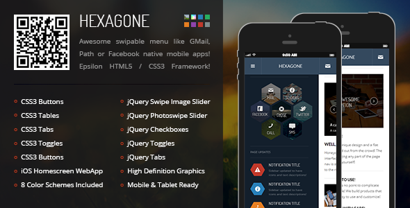
Hexagone is a multi-purpose creative template that can be used for anything from big businesses to coffee shops to photographers to bands! Creative and powered by our HTML and CSS Epsilon Framework it’s packed with desktop features, coded using CSS3, loaded instantly!


Drag to open the navigation


Facebook, GMail, Path style navigation, simply touch the body of the page with your finger and drag to the right side of the screen to show the navigation!


Insanely creative navigation


A navigation that is just different from the rest! With 8 color codes included your page will be truly unique! We’ve included a PSD file so you can create more nav icons on your own! It’s incredibly easy to do so!


Touch enabled, Multiple image, thumbs, text sliders!


Having just one slider variation is too simple, so we’ve made an … anything slider, because you can literally slide anything in it! It’s touch enabled, and it’s very easy to use! Also, the image slider has multiple variation captions and it’s responsive all the way!


You can also make your mobile page even more awesome by using a thumbnail gallery! We also have a colorbox portfolios but this baby is fullscreen, fast loading, preloaded, and looks like a native gallery!


The more CSS3 the faster!


We did our best to cut down page ressources so the load time is just mind blowingly fast, tons and tons of desktop class features and 90% of them are made using CSS3! It loads amazingly fast!


More CSS3, with no plugins, no fancy complicated code!


Don’t you just hate it when simple features are overly complicated to code? Here’s a fast example, horizontal charts! To make a chart in our template, you need 2 lines of code! That’s all! Round and square ones!


A perfect color ballance!


Flat is not flat if you don’t get the colors right, so we took extreme care to make the color palet absolutely stunning! Check it out for yourself!


Typography Features


  • 1, 2, 3 text columns

  • 1, 2, 3 image columns

  • 1, 2, 3 icon columns

  • CSS3 8 text highlight variations

  • CSS3 Code structures

  • CSS3 Table

  • CSS3 Speach bubbles

  • CSS3 Fields

  • CSS3 8 Color variation small buttons

  • CSS3 8 Color variation big buttons

  • CSS3 8 Buttons with 400 retina ready icons

  • CSS3 Hoirzontal square and rounded charts

  • 4 different testimonial variations

  • 48 icon lists


jQuery Features


  • Custom jQuery Code!

  • CSS3, AJAX, PHP contact form with validation

  • jQuery Page Preloader

  • jQuery Device detection

  • jQuery Tap sliding door

  • jQuery Submenus

  • jQuery 4 Toggle Variations

  • jQuery Tabs

  • jQuery Big Notifications

  • jQuery Small Notifications

  • jQuery Checkboxes

  • jQuery Radioboxes

  • jQuery Image Slider

  • jQuery Qute Slider

  • jQuery Text Slider

  • jQuery Thumbnail Slider

  • jQuery Colorbox Portofolio

  • jQuery Swipebox Touch Swipe Gallery


Design Features


  • Ergonomic navigation

  • High Definition Graphics for high definition displays

  • Looks gorgeous on iOS, Nokia, Samsung, HTC, and any device with a high DPI screen and low DPI screen!

  • 48 High definition list icons

  • 400 Icons included for general usage and for the PSD

  • 2 PSD Files included to create new nav items

  • PNG graphics hihgly optimized for extremly fast load times

  • iOS Homepage Icon

  • iOS Splash Screen


Requires iOS 5 or higher, Android 4.0.3 or higher, Windows Mobile 8, latest RIM OS.


KW7 (Mobile)

KW7, based on the colouring of the newest Apple system, is the connection of functionality and simplicity in use.


Scope of options:


  • Fully responsive layout created in the convention of “Mobile First”

  • Standard HTML 5 and CSS 3

  • Created on Foundation base

  • Menu Off-Canvas

  • Three-column grid system

  • Responsive photo slider – touch optimized

  • The Twitter plugin – supported by Twitter API 1.1

  • The Flickr plugin

  • Wide selection of icons thanks to FontAwesome

  • Editable elements of forms

  • More than 10 examples of edited webpages

  • Typography

  • Fast-action buttons: One Touch Email, One Touch Phone Call, One Touch Message

  • ... and many more!


KW7 Theme


KW7 Theme


KW7 Theme


KW7 Theme


KW7 Theme


KW7 Theme


Changelog:


v1.2.1 :: 04.12.2013

* FIX: Changes in the color version template settings

v1.2 :: 25.11.2013

* NEW: 12 color schemes
* NEW: Pinned header
* NEW: Page preloader
* CHANGE: Modified slider’s appearance
* CHANGE: Spaces between columns corrected

v1.1 :: 12.11.2013

* NEW: Search option
* NEW: Login page
* NEW: User profile page
* CHANGE: Fontawesome library update to version 4.0.3

v1.0

* First Release

darkley | Mobile HTML/CSS Portfolio Template (Mobile)

\\


darkley | Mobile HTML/CSS Portfolio Template


Dark, simple, modern but with all the features you’d need!


This mobile portfolio template adapts to any mobile device. It has no fixed sizes for specific devices, and runs on any screen size, and orientation.


HiDPI ready means it will look sharp on any HiDPI display, including retina.


Main Features


  • 12 Page Templates

  • Working Contact Form

  • 6 Color Schemes

  • Custom Css Framework

  • Valid HTML/CSS

  • Liquid structure (it adapts to any screen size)

  • HiDPI ready


Other Features:


  • 48 small icons (24 light, 24 dark)

  • 48 services icons (24 light, 24 dark)

  • 24 social icons (12 light, 12 dark)

  • 24 button icons

  • 6 color styles for the buttons

  • a custom structure which (it includes secondary Css files for you to add your custom rules in) allows you to customize the template and still be able to update it later on without breaking anything

  • free support for bug fixes


Useful Add-ons:


Notes:


The images you see in the preview are not included in your “source” ZIP. You will receive place-holders.


\
\